Blog · Custom Web Controls
The 10 best operator input Custom Web Controls for WinCC Unified and WinCC V8: sliders, keypads, toggles and date pickers (free)
We opened every operator input Custom Web Control in the HMIx catalogue in mid-November 2026, more than twenty sliders, keypads, switches, buttons and pickers, looked at each preview up close, read every product sheet and kept the ten we would trust to write a value into a WinCC Unified or WinCC V8 project. All free, all packaged as a CWC ZIP, and each one the best at a different job: from picking a date to typing a batch name.
- Custom Web Control
- CWC
- WinCC Unified
- WinCC V8
- TIA Portal
- Operator input
- Slider
- Date time picker
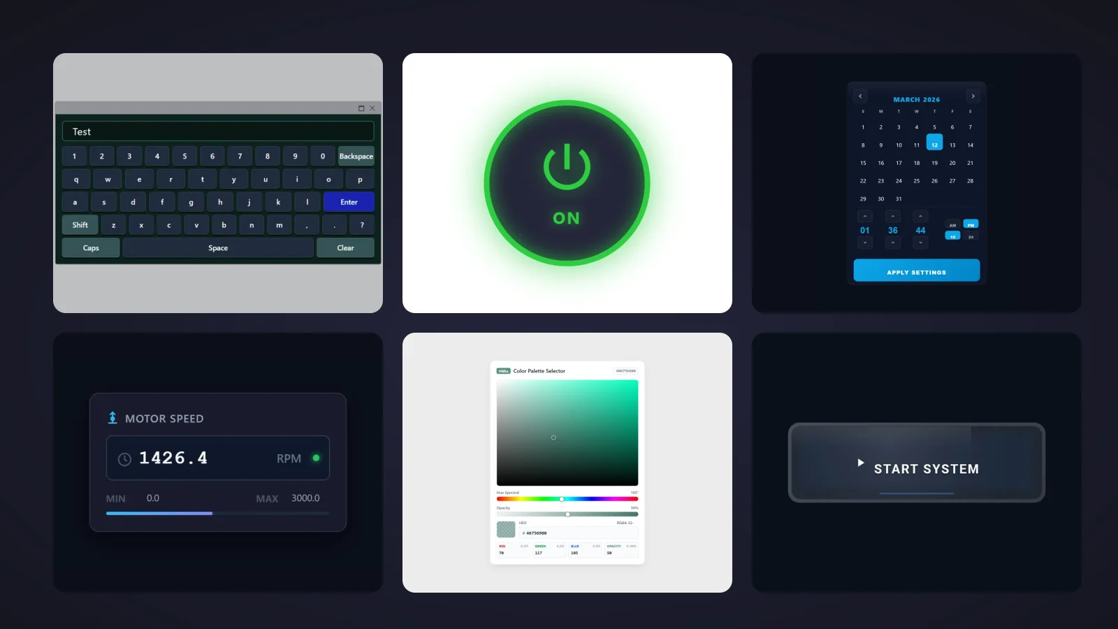
Quick picks
Short on time? Jump straight to the input control you need.
- 01Best overall: date and time pickerDate Time Picker
- 02Best compact setpoint sliderCompact Slider
- 03Best on-screen keyboard (alphanumeric)Virtual Keyboard
- 04Best numeric keypadNumeric Keypad
- 05Best validated value field (limits and messages)Speed IO Field
- 06Best on/off toggle switchModern Boolean Switch
- 07Best big start/stop toggle (glowing state)Glow Toggle Button
- 08Best command button (pressed and released events)Enhanced Button
- 09Best dropdown selector (recipes and modes)Recipe Selector Dropdown
- 10Best colour pickerRGB Color Picker
Why an operator input Custom Web Control is worth it
Most of what we put on an HMI screen only reads: levels, states, trends. Input controls are the other half, the ones that write. A setpoint slider, a keypad for a batch quantity, a switch from manual to automatic, a date for the next maintenance window or a recipe from a list. They are small, they are everywhere and, when they are clumsy, operators notice them every single shift.
The standard WinCC toolbox covers the basics, I/O fields, buttons and sliders, and for many screens that is enough. An operator input Custom Web Control (CWC) earns its place when you need more in one object: a calendar with an Apply button, a full on-screen keyboard, a field that validates its limits and tells the operator why, or a toggle that glows when it is on. A CWC is a small web application, HTML, CSS and JavaScript packaged as a ZIP, that WinCC Unified (TIA Portal) and WinCC V8 run inside the screen. Its properties appear in the Interface list like any other, so a tag such as currentValue or value is both read and written, and its events, such as ValueChanged, let your scripts react to every operator entry.
What makes an input control worth downloading
Before the list, the yardstick. Input controls write to your process, so we were stricter than usual:
- Clear about what it writes. Named properties on the product sheet, ideally a single value property, so you know which tag to bind and which tag it will change.
- Built for fingers. Big targets, obvious states and nothing that depends on hovering, because many of these screens live on touch panels.
- Confirmation and limits where they matter. An Apply button, a minimum and a maximum, or an error message beat a value that jumps straight into the PLC.
- Events for your scripts.
ValueChanged,Pressed,EnterClickedand the like let you log, confirm or chain actions without polling tags. - The right input for the job. A date picker, a slider, a full keyboard, a numeric keypad, a validated value field, a switch, a toggle button, a command button, a dropdown and a colour picker: we picked one champion per job.
How we picked them (and what we did not do)
We searched the HMIx catalogue in mid-November 2026 for every free Custom Web Control an operator uses to enter something: sliders, buttons, switches, keypads, keyboards, I/O fields, dropdowns, date pickers and colour pickers. For each candidate we looked at its real preview (not the catalogue cover with the big title on top) and read its product sheet to see which properties, events and methods it documents. Downloads only worked as tie-breakers. Full applications such as recipe managers and schedulers were left for another day.
Six controls went to the honourable mentions. We discarded the Graphical Step Slider, the IP Address Input and the MultipleSlider because their galleries only show the control's icon; three Dynamic Dropdown Lists whose previews are a plain browser list on an empty canvas; a DateTime Selector with both calendars empty; and a Recipe Selector whose preview is almost invisible, dark grey on black. Where a gallery published a small control in the middle of a huge empty canvas, we cropped the empty background for this article, without touching the drawing. And a fair warning: we judged previews and documentation; we did not run these controls in a live Runtime. They were generated with AI and every product page reminds you to test them in your own TIA Portal project before production.
The 10 best operator input Custom Web Controls, one by one
Each entry shows the real preview, what we liked, what to keep in mind and the properties named on its product sheet, followed by the catalogue thumbnail: click it to open the product page and download the control for free.
01Best overall: date and time picker
Date Time Picker
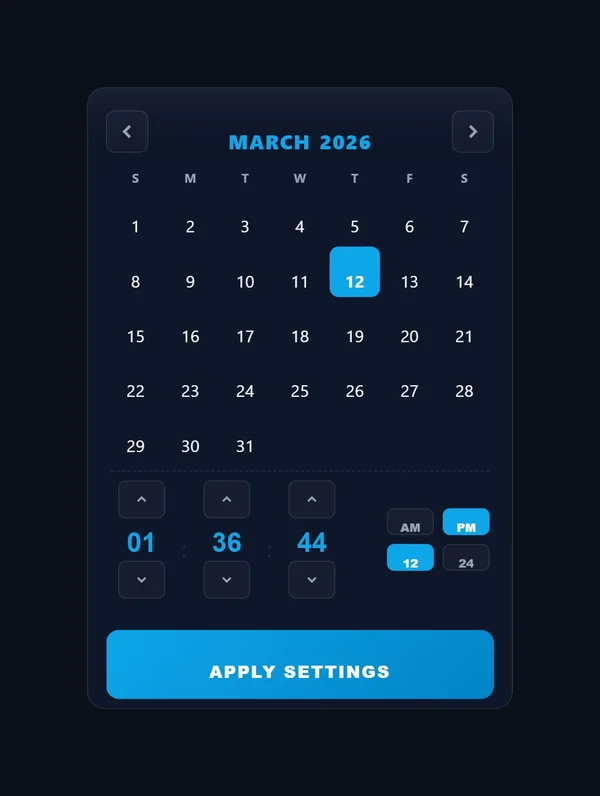
The most downloaded control in this article, and it shows why. A dark panel with a month header ("MARCH 2026") and arrows, a seven-column calendar with the 12th highlighted in blue, three spinners for hours, minutes and seconds (01, 36, 44), small AM/PM and 12/24 selectors and a wide blue "APPLY SETTINGS" button. It is the calendar you wish TIA Portal had when someone asks for "start date of the report". In November 2026 it had 43 downloads and four five-star reviews.
The sheet is generous. is24HourFormat switches the clock, showSeconds adds the seconds spinner, and the result arrives twice: as a localised string in selectedDateTime and as an ISO string in selectedDateTimeISO, the one you want for scripts and databases. With useApplyButton and applyButtonText, nothing changes until the operator confirms, and then the DateTimeChanged event fires. monthNames, weekdayLabels, amLabel and pmLabel translate it, accentColor, surfaceColor, textColor and backgroundColor theme it, and the setDateTime, resetToToday and resetToNow methods let a script move it.
What we like
- Calendar, time and confirmation in one object
- ISO output ready for scripts, reports and databases
- Every text translatable, from months to AM/PM
Keep in mind
- The preview starts the week on Sunday and the sheet does not mention a first-day setting (its sibling in the mentions has
firstDayOfWeek) - Tall format and small day numbers: give it room on the screen
Bindable properties
- is24HourFormat
- showSeconds
- selectedDateTime
- selectedDateTimeISO
- useApplyButton
- applyButtonText
- monthNames
- weekdayLabels
- accentColor
- backgroundColor
02Best compact setpoint slider
Compact Slider
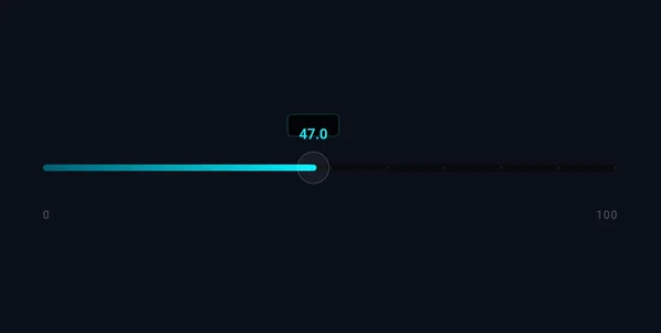
When the screen is already full. A slim horizontal track on a dark background, a cyan fill with a soft glow up to the thumb and a small tooltip above it ("47.0"), with "0" and "100" at the ends. It takes the height of a text line and still gives the operator something to drag, which makes it a good fit for a row of setpoints on an HVAC, speed or level screen.
Its sheet counts 12 properties and names them all, which is rarer than it should be. currentValue is the value you bind (untick Read only so it can write), minValue, maxValue and step define the range and increment, showTooltip and showLabels toggle the helpers, minLabelText and maxLabelText rename the ends, and fillColor, glowColor, trackColor and backgroundColor set the look. The ValueChanged event tells your scripts when the operator moves it.
What we like
- All twelve properties named on the sheet
- Step property for clean, repeatable setpoints
- Very low profile: fits between other fields
Keep in mind
- Horizontal only, and in the preview the empty track and the 0 and 100 labels are very dim
- A thin track is a small touch target: test it on the real panel
Bindable properties
- currentValue
- minValue
- maxValue
- step
- showTooltip
- showLabels
- minLabelText
- maxLabelText
- fillColor
- glowColor
- trackColor
- backgroundColor
03Best on-screen keyboard (alphanumeric)
Virtual Keyboard
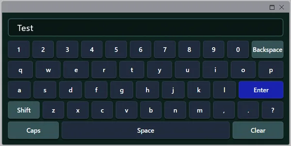
For the day someone has to type a batch name on a panel without a keyboard. A dark green keyboard with an entry bar at the top ("Test"), a row of digits with "Backspace", three QWERTY letter rows with a blue "Enter" key, "Shift", punctuation and a bottom row with "Caps", a wide "Space" and "Clear". It looks like what it is, and nobody needs training to use it. In November 2026 it had 17 downloads and two five-star reviews.
showPreview shows or hides the entry bar. The events are where it shines: ValueChanged follows the typing, EnterClicked tells you the operator is done and ClearClicked that they started over, so a script can write the text to a tag only on Enter. The setValue and clearValue methods prefill or reset it. For the look, backgroundColor, keyBackgroundColor, specialKeyBackgroundColor, accentColor (Shift and Caps active) and enterKeyColor, and backspaceLabel, enterLabel and spaceLabel rename the special keys.
What we like
- Familiar full keyboard with Enter, Clear and Caps
EnterClickedevent: write the text only when it is confirmed- Special key captions renamable for your language
Keep in mind
- The preview shows a QWERTY layout; the sheet mentions no other layouts or accented characters
- A grey title bar with window icons sits above the keyboard in the preview
Bindable properties
- showPreview
- backgroundColor
- keyBackgroundColor
- specialKeyBackgroundColor
- accentColor
- enterKeyColor
- backspaceLabel
- enterLabel
- spaceLabel
04Best numeric keypad
Numeric Keypad
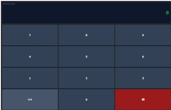
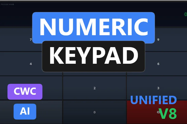
Calculator-style entry for quantities and limits. A wide display at the top with a small "PROCESS VALUE" label and the value in green on the right ("0"), then a grid of large slate-blue keys, 7-8-9, 4-5-6 and 1-2-3, and a bottom row with "CLR", "0" and a red backspace key. The keys are huge, which is exactly what you want with gloves on.
Its sheet counts 8 properties and names them all. value is read and written, so the keypad and the PLC stay aligned, labelText names the value and clearButtonText renames CLR, and backgroundColor, displayBackgroundColor, displayTextColor, keyColor and keyTextColor set the palette. ValueChanged and Cleared feed your scripts, and setValue and clear control it from outside.
What we like
- Big keys for gloved fingers
- Short interface, all eight properties named
- Bidirectional
value: the display shows the current tag value
Keep in mind
- The preview has no decimal point or minus key: fine for counts and quantities, not for -2.5
- No Enter key in the preview: decide in your scripts when an entry counts as final
Bindable properties
- value
- labelText
- clearButtonText
- backgroundColor
- displayBackgroundColor
- displayTextColor
- keyColor
- keyTextColor
05Best validated value field (limits and messages)
Speed IO Field
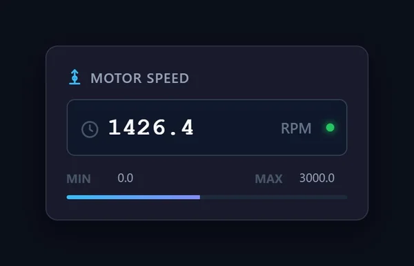
An I/O field that knows its limits. A dark card titled "MOTOR SPEED", a field with the value in large monospaced digits ("1426.4"), the unit "RPM" and a green status dot, and underneath "MIN 0.0", "MAX 3000.0" and a blue bar showing where the value sits in the range. The operator sees the value, the unit and the allowed range before typing anything.
Its sheet names ten of its 11 properties. speedValue is the bidirectional value, minValue and maxValue the limits, decimals the resolution and conversionFactor scales the display. When an entry breaks the rules, outOfRangeMessage or invalidFormatMessage tells the operator why and the ValidationError event fires. readOnly turns it into a display (bind it to the user's permissions), label names the drive and backgroundColor themes it. The setValue and setLimits methods let a script change the value and the range.
What we like
- Range check with a clear message, not a silent rejection
- Range bar gives context at a glance
- Read-only mode you can tie to permissions
Keep in mind
- The unit property is described ("RPM or Hz") but not named exactly: check the Interface list
- The name says speed: for other values you will rename the label and unit
Bindable properties
- speedValue
- minValue
- maxValue
- decimals
- conversionFactor
- outOfRangeMessage
- invalidFormatMessage
- readOnly
- label
- backgroundColor

06Best on/off toggle switch
Modern Boolean Switch
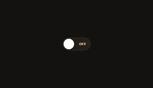
The switch you know from your phone, made for Boolean tags. A dark, pill-shaped track with a white round thumb on the left and "OFF" in warm amber letters. Its sheet promises 180 ms animated transitions and support for touch, mouse and keyboard, and it suggests the obvious uses: motors, heaters, conveyors, or manual versus automatic mode.
Its sheet counts 9 properties and names them all. Value is the Boolean, LabelText the caption, OnText and OffText the words inside, and OnColor, OffColor and ThumbColor the palette. Enabled and ReadOnly stop accidental changes, for example while a sequence is running, and OnValueChanged fires when the operator flips it.
What we like
- Instantly understood: on, off, nothing else
- Enabled and ReadOnly to lock it during critical phases
- All nine properties named
Keep in mind
- The preview only shows the off state on a large dark canvas (cropped for this article)
- Small by default: scale it up for touch panels
Bindable properties
- Value
- LabelText
- OnText
- OffText
- OnColor
- OffColor
- ThumbColor
- Enabled
- ReadOnly
07Best big start/stop toggle (glowing state)
Glow Toggle Button

Impossible to miss. A big round button with a thick green ring, a green power symbol and "ON" underneath, wrapped in a soft green halo. It is a toggle with status built in: you press it to switch and its glow tells everyone, from across the room, what state it is in.
Its sheet counts 8 properties and names them all. value is read and written, labelOn and labelOff set the text for each state, headerText adds a caption, glowIntensity dials the halo up or down, and colorOn, colorOff and backgroundColor set the colours. The OnChanged event and the toggleState and setState methods complete the picture. Pumps, lighting circuits, manual overrides: anything with two states and a need to be seen.
What we like
- Huge touch target with a power icon everyone recognises
- Glow makes the state visible from far away
- All eight properties named, with on and off texts
Keep in mind
- The preview sits on a light background and shows no header: set
backgroundColorfor dark screens - A toggle writes on every press: for critical starts, add a confirmation in your scripts
Bindable properties
- value
- labelOn
- labelOff
- headerText
- glowIntensity
- colorOn
- colorOff
- backgroundColor
08Best command button (pressed and released events)
Enhanced Button
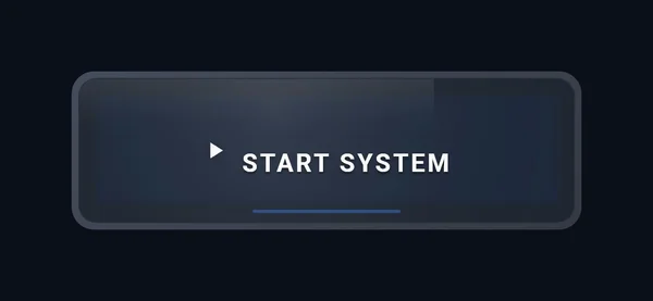
A command button with presence. A wide, rounded dark button with a grey frame, a white play icon, "START SYSTEM" in spaced capitals and a thin blue LED line under the text. According to its sheet, it tilts in 3D following the mouse when enablePerspective is on, and the LED bar and glow take the accentColor.
The events are the reason to pick it: Clicked, Pressed and Released separately, which is what you need for momentary commands such as jogging, where the action must stop when the finger lifts. setText and setIcon change the caption and icon at runtime, iconType picks a vector icon, borderRadius shapes it and backgroundColor, buttonColor and textColor theme it.
What we like
- Separate Pressed and Released events for momentary actions
- Icon and text changeable at runtime
- LED bar to show the command's state
Keep in mind
- The sheet counts 8 properties and names seven: the caption property is not named (there is a
setTextmethod) - The 3D tilt follows the mouse, so on a touch panel you will not see it
Bindable properties
- enablePerspective
- accentColor
- iconType
- borderRadius
- backgroundColor
- buttonColor
- textColor
09Best dropdown selector (recipes and modes)
Recipe Selector Dropdown
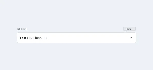
A dropdown that writes a number. A light field labelled "RECIPE" with the current choice ("Fast CIP Flush 500") and a chevron, plus a small "Tag:" badge that, according to its sheet, shows the numeric index of the active recipe. It is the quickest way to let an operator pick one of several predefined options without a full recipe screen.
recipesJson takes the list of labels and numeric values, selectedValue writes the chosen number back to the PLC (untick Read only) and selectRecipe sets it from a script. SelectionChanged, DropdownOpened and DropdownClosed cover auditing and scripting, showBadge and badgePrefix control the badge, labelText and placeholderText the texts, isEnabled locks it during critical phases, and accentColor and backgroundColor the theme. Nothing stops you using it for operating modes or product types as well.
What we like
- Writes a clean numeric index your PLC can use
- List defined in one JSON property
- Lockable with
isEnabledwhile a batch runs
Keep in mind
- In the preview the badge text wraps and its number hides behind the field
- Small, light control on a large canvas in the gallery (cropped for this article)
Bindable properties
- recipesJson
- selectedValue
- showBadge
- badgePrefix
- labelText
- placeholderText
- isEnabled
- accentColor
- backgroundColor
10Best colour picker
RGB Color Picker
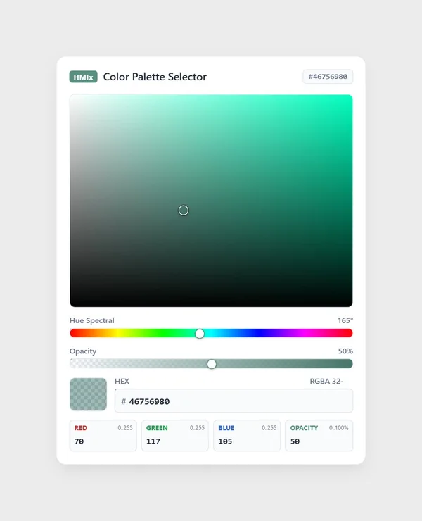
Niche, but beautifully done. A white card titled "Color Palette Selector" with an "HMIx" badge and the current hex code, a large saturation and brightness square in shades of green, a "Hue Spectral" slider at 165°, an "Opacity" slider at 50 %, a hex field ("# 46756980") and four boxes for red 70, green 117, blue 105 and opacity 50. It is the cleanest picker in the catalogue.
Where does a colour picker fit on an HMI? Letting a supervisor assign colours to products, lines or alarm classes, or theming a screen without engineering. selectedColor carries the colour as a 32-bit ARGB value and hexColor as a string, showAlphaSlider and showRgbChannels hide the advanced parts for simpler roles, and titleText, tagBadgeText and backgroundColor adjust the card. ColorChanged follows the operator live and ColorCommitted marks the final choice, so you write the tag once.
What we like
- Visual and numeric entry in the same card
- Separate live and committed events
- Advanced channels can be hidden
Keep in mind
- Its sheet counts 11 properties and names seven exactly; the red, green, blue and opacity properties are described without their exact names
- In the preview the "RGBA 32-" label is cut off
Bindable properties
- selectedColor
- hexColor
- showAlphaSlider
- showRgbChannels
- titleText
- tagBadgeText
- backgroundColor
Honourable mentions: six more input controls worth a look
Six controls that did not make the top ten because of their previews or their sheets. Click the thumbnail to open the product page.
HTML5 Slider
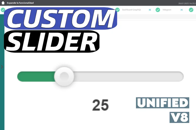
The most downloaded slider in the catalogue (25 downloads in November 2026): horizontal or vertical, custom colours, min, max and step, and optional tag writing while sliding. It comes with a video, a README and a TIA Portal V17 demo project, but its sheet does not name the properties.
View product
Customizable Graphic Slider
A cyan slider with a custom thumb, scale markings and horizontal or vertical orientation. Its sheet counts 19 properties, 2 events and 2 methods without naming them, and the preview is a small slider at 50.00 in a large dark card.
View product
Push Button
A momentary button in the style of a 22 mm actuator, with
View productPressedandReleasedevents andisPressed,isIlluminated,colorOnandcolorOffproperties. The preview is a flat grey START button: neither the illumination nor the metallic bezel described on the sheet is visible.
Emergency Stop
A red mushroom button inside a yellow ring with curved "EMERGENCY STOP" text and a "SYSTEM READY" status line, with latching and a reset sequence. Its sheet counts 13 properties without naming them. And remember: an on-screen button never replaces the hardwired emergency stop circuit.
View product
IO Field with Error Value
One of the best-documented fields in the catalogue: it compares
View productprocessValuewitherrorValuewithinerrorToleranceand shows a red cross anderrorTextinstead of a misleading number, and checks entries againstminValueandmaxValue. The preview only shows "4.27 bar" on a large empty canvas, without the error state.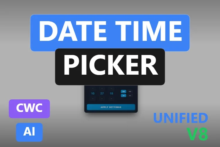
Date Time Picker
The sibling of our top pick, with 17 properties including
View productfirstDayOfWeek,headerMonthFormatand an ISO 8601dateTimeValue. The preview is a tiny calendar in the middle of a large white canvas, hard to judge.
Didn't find your input control? Make your own (or remix one) with AI, for free
A confession: every input control in this article was created with the HMIx AI generator. That is why we can say this without blushing: if none of them asks the operator for a value the way you need, you can generate your own in minutes.
Describe the control in plain words (for example, "numeric keypad with a decimal point and a minus key, an Enter key that writes the value, and minimum and maximum limits with an error message") and the generator walks you through it step by step: the design, the properties, events and methods you will use in WinCC, a simulation to try values and the final Custom Web Control package for WinCC Unified and WinCC V8. The same tool also builds dynamic SVGs when a lightweight drawing is all you need.
- Remix any control on this list: on its product page, the "Edit in AI Generator" button opens it straight in the generator, ready for you to ask for changes such as "add a decimal point to the keypad", "start the calendar week on Monday" or "make the slider vertical". The "Edit it with AI" links in this article do the same.
- Free to try: you can start without an account, with a small daily allowance of credits, and the Community plan is free.
- The result is yours to use: download the package and add it to your TIA Portal project like any other control on this page.
How to use an operator input Custom Web Control in WinCC Unified (and WinCC V8)
The short version, for when you have already picked your control. Our Custom Web Control guide covers every step with diagrams and screenshots.
Download the ZIP
Open the product page, sign in with your free account and download the control. The downloaded ZIP contains the documentation and, inside it, the control package named
{GUID}.zip: that inner file is the one you need.Copy it into your TIA Portal project
Copy the
{GUID}.zipfile, still compressed, into your project folder underUserFiles\CustomControls(create both folders if they do not exist). Do not extract it.Refresh My controls and drag it in
In TIA Portal, open the Tools task card, expand My controls and click Update. The control appears in the list: drag it onto your screen and size it.
Bind the value and untick Read only
Select the control and open Inspector window → Properties → Properties → Interface. Bind the value property (
currentValue,value,Value,selectedValue…) to an internal tag and untick Read only, otherwise the control can read the tag but never write it. Add an I/O field showing the same tag, start Runtime and check that every entry arrives, and that limits and confirmations behave. Once it does, switch to your real PLC tags.On WinCC V8
Every top pick in this article is tagged as compatible with WinCC V8 on its product page. The package is the same; follow the WinCC V8 documentation for importing and configuring Custom Web Controls in that environment.
Pro tip: an input control is a door into your process, so do not leave all the checks to it. Repeat the minimum and maximum in the PLC, lock writes with the operator's permissions (readOnly, Enabled, isEnabled), prefer an explicit confirmation (an Apply button, EnterClicked, ColorCommitted) over writing on every keystroke, and keep safety functions, such as the emergency stop, in hardware where they belong.
Frequently asked questions
Are these operator input Custom Web Controls really free?
Yes. Every control in this article is published as a free product on HMIx. You only need a free account to download them.
How does a Custom Web Control write a value to a PLC tag in WinCC Unified?
Bind the control's value property to the tag in Inspector window → Properties → Properties → Interface and untick Read only for that tag. If Read only stays ticked, the control can show the tag's value but cannot write the operator's entry back. Events such as ValueChanged or EnterClicked let your scripts react as well.
Is there a date and time picker for WinCC Unified?
Yes. The Date Time Picker in this article adds a calendar with hours, minutes, optional seconds and an Apply button to WinCC Unified and WinCC V8, and returns the result both as a localised string and as an ISO string, which is convenient for scripts, report filters and databases.
Can I use an on-screen keyboard or numeric keypad on a Unified Comfort Panel?
The product pages of the Virtual Keyboard and the Numeric Keypad list compatibility with WinCC Unified, including Unified Comfort Panels, and with WinCC V8. As with any AI-generated control, test the behaviour in your own project and on your target device before going into production.
Can I put an emergency stop button on a WinCC screen?
You can show one, but an on-screen button is never a substitute for the hardwired emergency stop of a machine, which must work even if the HMI or the network fails. Use screen buttons for normal start, stop and reset commands and keep safety functions in the safety circuit.
Can I modify one of these input controls?
Of course. You can edit the HTML, CSS and JavaScript of the control yourself, or press "Edit in AI Generator" on the product page and ask for the changes in plain language. The second option is usually faster, because the generator takes care of the interface and the packaging.
Our verdict
If you only download one, make it the Date Time Picker: a calendar, a clock and an Apply button that fill a real gap in WinCC screens. For a compact setpoint, the Compact Slider; for text, the Virtual Keyboard; for quantities, the Numeric Keypad; for a value with limits and clear messages, the Speed IO Field; for on and off, the Modern Boolean Switch; for a big start/stop with a glowing state, the Glow Toggle Button; for momentary commands, the Enhanced Button; for picking from a list, the Recipe Selector Dropdown; and for colours, the RGB Color Picker.
And if your screen needs an input none of these offers (it always does), remember that the generator that built them is just one click away.